Verdict
The iPhone 14 Pro is a fantastic phone, even if it’s not necessarily a huge upgrade from the iPhone 13 Pro.
Pros
- Great screen that gets very bright outdoors
- Versatile camera system for both photography and videography
- Always-on display and Dynamic Island are both neat tricks
- Additional safety features are always welcome
Cons
- Not the quickest to charge
- Zoom photography isn’t on the level of the competition
- Only really a day of battery life
-
Completely new wide cameraThere’s now a 48MP megapixel main camera on the back, giving you more freedom with shots -
Dynamic IslandThe notch now has more functionality -
Top-end specsA16 Bionic chipset, 6GB RAM and up to 1TB storage
Introduction
The iPhone 14 Pro is Apple’s top flagship phone for 2022, sitting above the more modest iPhone 14.
For the first time, recommending the iPhone 14 Pro over the cheaper iPhone 14 seems obvious – this is where the true innovation from Apple is this year.
At least, it feels like the start of an innovation cycle. The iPhone 14 Pro features a number of upgrades and changes that will likely become series stalwarts over the next few years and I can see many of them being copied by rivals.
After a fairly slow year for high-end phones in general, with many of the best Android phones only receiving minor updates over their predecessors, the iPhone 14 Pro has the potential to offer something truly new. But does it succeed?
Screen and Design
- Dynamic Island is a smart, if underutilised, alteration to the notch
- Excellent, bright display
- Squared-off design is more comfortable in the smaller size
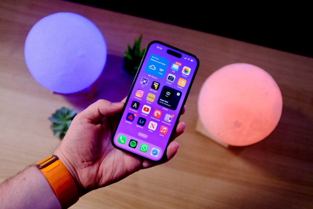
Place the iPhone 14 Pro next to the 13 Pro and there’s one immediately obvious difference – the notch. While it remains, it’s no longer attached to the top bezel, instead allowing the display to wrap around. In typical Apple fashion it has named this notch the Dynamic Island.
I am sure we can all agree it’s a silly name, but in actual use it’s a big improvement. Apple has managed to take one of my biggest issues with the previous model and made it a selling point of the iPhone 14 Pro.
The Dynamic Island comprises the elements of the True Depth camera system required for the very quick (and equally reliable) Face ID unlocking system and a new software layer that makes it seem like certain UI elements are appearing out of the notch.
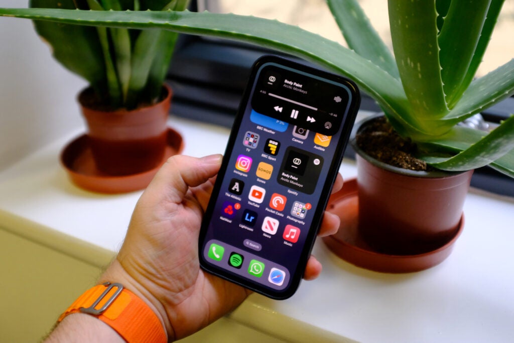
Start a song playing in Spotify and head back to the home screen and that song will jump to the Dynamic Island, becoming always visible whatever app you’re in. Start a timer now and the Dynamic Island will split in two, allowing you to easily keep an eye on what music is playing in the background and how long is left on the timer. You’ll get a pop-up in the Dynamic Island when you connect AirPods or when your battery is low, notifications that before never really had a proper place to go.
The Dynamic Island also works with the upcoming Live Activities API to allow apps to use it and show information. Deliveroo, for example, could show you the location of your dinner without you needing to open the app, or a sports app could allow the score of a match to be always visible.
I am a big fan of the way the Dynamic Island works and the idea behind it, and it adds an extra interaction layer to the phone. You won’t interact with it a lot, at least not until more apps can take advantage of it, but tricks like being able to quickly change the song are helpful. It does still feel a little undercooked though, as we won’t see its true benefits for a while yet.
I find it odd that tapping on the Dynamic Island takes you back to an app, whereas a long press brings up quick controls – for me, the other way around makes more sense. There are also times when the standard notification system and the Dynamic Island system overlap, making me wonder why they weren’t combined together.
Elsewhere, the iPhone 14 Pro retains the visual style of the iPhone 13 Pro, and aside from being able to go brighter in certain instances, the screen is the same too. It’s a very flat phone, with shiny stainless steel sides that smudge easily and a frosted glass back. It’s still IP68 rated for protection against water and dust and there’s a Ceramic Shield coating for added drop protection. I do wish the screen was a little more resistant to scratches though, as they seem to appear with increasing frequency.
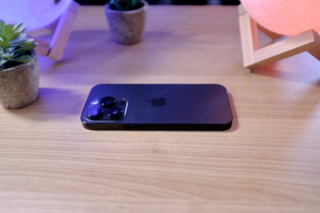
The Pro I am reviewing is the smaller of the two available with its 6.1-inch display. There’s also the iPhone 14 Pro Max, which ups the ante to 6.7-inches. It’s great that Apple remains the only brand out there packing top-end tech into a phone that can be grasped comfortably in my hand. It is a heavy phone though and at 206g, the iPhone 14 Pro weighs just under 30g more than Galaxy S22 with the same screen size.
The smaller phone suits the boxy, industrial design a lot more than the bigger model. With the Pro Max, I often found it digging into my palms if I’m using it without a case – but that’s not an issue with the Pro. I’d still recommend the Pro Max if you watch a lot of videos or play a lot of games on your phone, as the extra real estate is very welcome in those tasks.
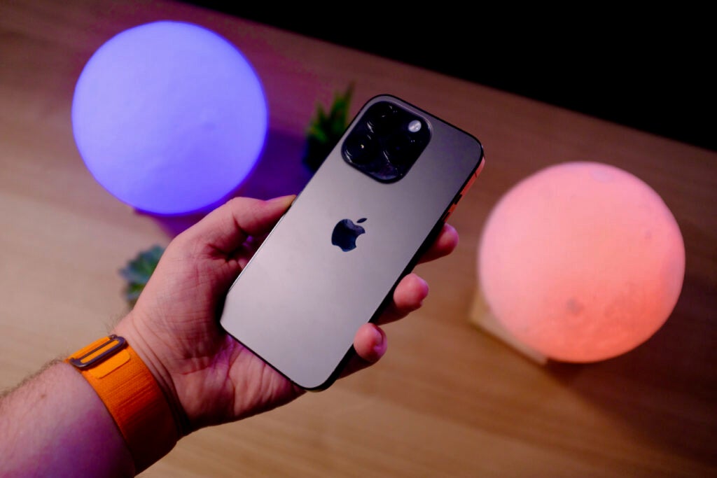
I’ve loved the displays on Apple’s phone since it switched to OLED panels and once again it’s fantastic here. The 6.1-inch panel is sharp and gets seriously bright. No other phone I have reviewed, even the Galaxy S22 Ultra, is as usable in direct sunlight as the iPhone 14 Pro and you’ll notice those extra nits of brightness in HDR video too.
Even though the screen is fairly small, I was still immersed in an episode of Andor playing in Dolby Vision HDR from Disney Plus. Colours popped, especially in bright scenes, and the OLED panel allowed for perfect deep and inky blacks.
The display retains the ProMotion skills first added with the iPhone 13 Pro. This allows the panel to ramp up (and down) how many times per second it refreshes. Scrolling and swiping is smoother than on the iPhone 14 as a result, and as the screen can now drop to 1Hz (refreshing once a second) there’s now the option to enable always-on display options.
Anyone familiar with the best Android phones won’t be too surprised to see this feature, but this is the first time it’s been added to an iPhone.
The always-on display here works as well as it does on an Apple Watch. When the device is locked, the wallpaper and clock fade into the background – they’re still visible, but the screen is dimmed. If the phone is on a desk you can glance at it to see the time (and any widgets on the lock screen) without unlocking it.
Most phones I have reviewed that have a similar feature enable it by utilising OLED’s ability to turn off all but the pixels being used, showing just the clock. But the iPhone 14 Pro actually keeps the whole screen on, wallpaper included, and just slows the refresh rate down to 1Hz to try and save battery.
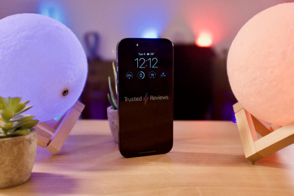
As a result, whatever your lock screen is, is represented by the always-on alternative and you can’t alter it. You can’t, for example, only have the clock showing unless you set a plain black wallpaper. You also can’t alter the brightness, meaning that at times I felt the always-on screen was a little too bright and distracting. In this respect, it can feel restrictive.
If you’re wearing an Apple Watch the always-on display should turn itself off when it knows you’re away from the phone and it will also turn off automatically when it’s in Sleep mode to avoid any distracting glow at night.
I do really like how the always-on display has been handled here, but it needs a little more customisation to make it really worthwhile. There is also a noticeable hit on battery life with it on – jump to the Battery Life section for more on that – so I can imagine many simply turning it off.
Camera
- The first iPhone with a 48-megapixel camera
- Big improvements to the selfie camera
- Excellent results in all lighting, though slightly too much processing on occasion
The iPhone 14 Pro is just about the best camera phone you can buy today. It’s not without its issues, I will dive into them below, but on the whole, it offers a versatile array of sensors, lenses and options that should please those who want to extract every detail out of a snap just as much as those who just want to shoot and share on Instagram.
The standout spec from the new rear camera array is the 48MP sensor sitting behind the wide lens. This is the first time Apple has gone above 12MP and the first time it’s used the pixel binning technique so common on Android phones.
Essentially, unless you manually switch to the ProRaw mode, the phone will continue to shoot 12MP images, but it’ll combine four pixels into one giving you an effective larger pixel size. The benefits of this include improvement to low-light snaps among others.
Switch to ProRaw mode and the camera will capture full uncompressed 48MP images that are huge in size (around 80MB each) and ideal for editing in apps like Lightroom or Photoshop, either on the phone itself or on a computer. For most people, shooting in ProRaw is unnecessary and the images that bin down to 12MP are usually excellent, but having the option is great for those who want to really tweak and tinker with the shots.
I’ve been shooting with the iPhone 14 Pro for over a week and it churns out excellent shots whatever the conditions are. It’s noticeably faster kicking into Night Mode than the iPhone 13 Pro and captures more details when it’s dark. Apple also uses the middle 12MP of the 48MP sensor to offer up a new 2x zoom, and the results from this are surprisingly great and ideal if you want to get a little closer to a subject.
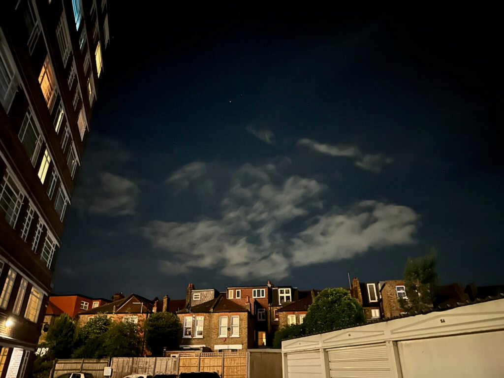


Shots taken in daylight conditions are also strong, although I often found it hard to differentiate between a landscape shot on the iPhone 13 Pro and one on the iPhone 14 Pro unless you zoom right in.

The results were excellent before, and they remain so now. Get up close to a plant or an item of food though and the bigger sensor makes itself known, with far greater natural depth of field for a lovely bokeh background.


Apple has tweaked some of the post-processing on photos this year, notably upping the sharpness to often frustrating degrees, with busy indoor pictures the biggest culprits. Usually though, colours in images are rich and pop with just the right amount of saturation. Forest greens look natural for instance, while the red on the boat propeller came across just as bright in real life. Skin tones look mostly natural, though Google’s Pixel 6 Pro does a better job portraying skin in general.
The sensor is bigger on the ultrawide camera too, although that has led to a slightly wider aperture. The tweaks to the software seem to appease this change in low-light situations and the results from this camera are great in good light and adequate when it gets darker. There are no such changes for the 12MP telephoto camera, and while the zoom is on par with phones that don’t utilise a periscope arrangement, it doesn’t come anywhere close to competing with the Samsung Galaxy S22 Ultra once you push past the 3x range, with images turning very blurry.

There’s now autofocus on the selfie camera which helps ensure detail is in the right places and the video skills remain the best out there. A new Action Mode steadies video of faster movement – at the expense of 4K resolution and any low-light performance – while the background blur-focussed Cinematic Mode now shoots in 4K, making it far more usable. The background blur can still be very hit or miss, though.
Performance
- Speedy performance across the board
- 5G spec varies by region, no SIM slot in the USA
- Up to 1TB storage
Every year I review the iPhones and every year it seems like I say the same thing – it’s the fastest phone you can buy. That’s once again the case here.
The A16 Bionic chipset and accompanying 6GB RAM is a tempting combination, comfortably playing any Apple Arcade game with ease and making light work of even hefty ProRes video exports and edits. There’s almost too much power here for anything you can do today and plenty of headroom for what’s to come in the future.
The tangible upgrades over the A15 Bionic from the iPhone 13 Pro and iPhone 14 are hard to spot in benchmarks and even in actual use. There are minor improvements in the array of benchmarking apps we use at Trusted Reviews, though only fairly small numbers, and even using the two chips side-by-side on two different phones the benefits are modest. I opened up a number of games on both and they only opened mildly quicker on the A16 Bionic.
Of course, the newer chip does have other benefits. It’s built on a more efficient process, so shouldn’t use as much juice in more demanding tasks and it’ll likely be supported by Apple with software updates for longer. Judging by my experience with older iPhones, this should last a good number of years before it starts to slow.
As I am reviewing a UK model of the phone it comes with sub-6 5G only, though considering there’s no mmWave network here yet, it hardly seems an issue for it to lack the support for that. If you buy the US model there will be support for mmWave, but there won’t be a physical SIM slot on the phone – pushing everyone towards eSIM.
As my colleague Hannah has pointed out, the switch to eSIM could be a costly one for some – but it shouldn’t be too much of an issue if you’re an iPhone user and plan to be for years to come. eSIM is far less widely adopted in the UK – Three, for instance, don’t yet support it – so it’ll be interesting to see if we keep the SIM slot for the iPhone 15 or whether this will be the last model with it.
There are another couple of features touted for the iPhone 14 Pro that you can’t necessarily see, or would possibly ever use. Car Crash detection is a feature you’ll never want to use – and one I can’t say I have tested for this review – but the idea is that it’ll alert the local emergency services if you’re unable to after a crash.
The iPhone 14 Pro also supports Apple’s Emergency SOS via satellite feature that’ll launch first in the US and Canada in November. This will allow the phone to reach emergency services even if you’re out of network reach.
These are both interesting additions to a phone. Neither would make me rush out and upgrade, yet expanding what we expect from a phone is a strong proposition, especially as it becomes harder and harder to offer notable performance and camera upgrades year over year.
Call quality is excellent, as is Wi-Fi performance (although there’s no WiFi 6E support) and the haptic response remains the best of any phone I have reviewed.
Battery Life
- Similar endurance to the iPhone 13 Pro
- No charger included
- Multiple wireless charging options
Switching from an iPhone 13 Pro Max, I was initially a little disappointed by the endurance of the 14 Pro. But that’s more to do with my personal expectations after spending most of the past year with Apple’s bigger phone. However, after my near two weeks with the phone I don’t think battery life is a weakness – even if it’s not taken any great strides forward.
Throughout a typical day with the always-on display enabled, the screen set to automatic brightness and hundreds of notifications coming through I got from an 8 AM alarm to midnight bedtime with about 10-15% left. Turn the always-on display off and it was more like 15-20% depending on how busy the day was. That’s perfectly acceptable endurance if you’re happy to charge the phone up every night and slightly better than the results I got with the 13 Pro.
There are factors that massively impact the battery life, though. Pushing the screen full-blast with HDR content can eat through 15% an hour, more than I have noticed on an iPhone before, and if the brightness is being pumped in super-bright conditions it’ll drain even faster. Tone things down though, and you’ll be nearer 10% per hour for video streaming.
On a couple of very busy days, notably the ones with lots of music streaming to a connected pair of AirPods Pro 2 and some gaming, I felt the need to charge the phone up a bit once I had got home from work.
There’s no charger included, but a 20w plug paired with the included USB-C to Lightning cable got me a 50% charge in 32 minutes and to 100% in 99 minutes. Those results are virtually the same as the iPhone 13 Pro.

Wireless charging remains the slower option. Apple’s MagSafe charger tops out at 15w, while a standard Qi pad will max out at 7.5w. None of these speeds are groundbreaking, especially compared to some of the phones, like the OnePlus 10T, that can go from 0-100% in less than 20 minutes.
Should you buy it?
You hate the notch: The Dynamic Island turns the notch into a new way to interact with the phone. Once developers start building it into their apps, this could be a huge shift in how we use an iPhone.
If you went for the iPhone 13 Pro last year: There are a lot of nice upgrades here, though nothing stands out too much if you upgraded to the iPhone 13 Pro in the past year. You’re better off waiting to see what Apple has in store for 2023.
Final Thoughts
The iPhone 14 Pro is an excellent phone, even if it’s not necessarily a huge upgrade from the iPhone 13 Pro. If you’re coming from an older model – maybe an 11 Pro or one of the non-Pro phones – then the differences can be stark.
The Dynamic Island is a silly name but turns an annoying design quirk into something useful, while the cameras are very powerful if pushing them to the limit is of interest. The display remains gorgeous, while the performance boosts might not make themselves known for a few years yet.
On a personal level, I would have liked a switch to USB-C over Lightning and a bigger focus on faster charging for quicker top-ups when you’re in a pinch. Other phones, notably the Samsung Galaxy S22 Ultra, remain far more competent at zoom photography, too.
It’s not been a standout year for phone upgrades. Samsung did the bare minimum with the S22 series and Android makers have struggled to really push things forward. The iPhone 14 Pro also isn’t a massive leap, yet it packs enough features to make this the best phone you can buy right now.
FAQs
There is no charging plug in the box, just a USB-C to Lightning cable. If you’re buying a new plug, look for one that supports 20w charging.
The Pro model sports a better screen, faster chipset and an extra camera.
Four colours are available: Deep Purple, Space Black, Gold and Silver.
Jargon buster
IP rating
An abbreviation for ‘Ingress Protection Code’, which lets you know to what extent a device might be waterproof or dustproof.
mAh
An abbreviation for milliampere-hour and a way to express the capacity of batteries, especially smaller ones in phones. In most cases the higher the mAh, the longer the battery will last but this isn’t always the case.
OLED
Organic Light Emitting Diode is panel technology that allows each individual pixel to produce light rather than relying on a backlight. This enables the screen to accurately display blacks by turning off the pixel, resulting in improved contrast compared to conventional LCD panels.
iOS
The operating system that powers Apple’s mobile devices.


